BRAND IDENTITY
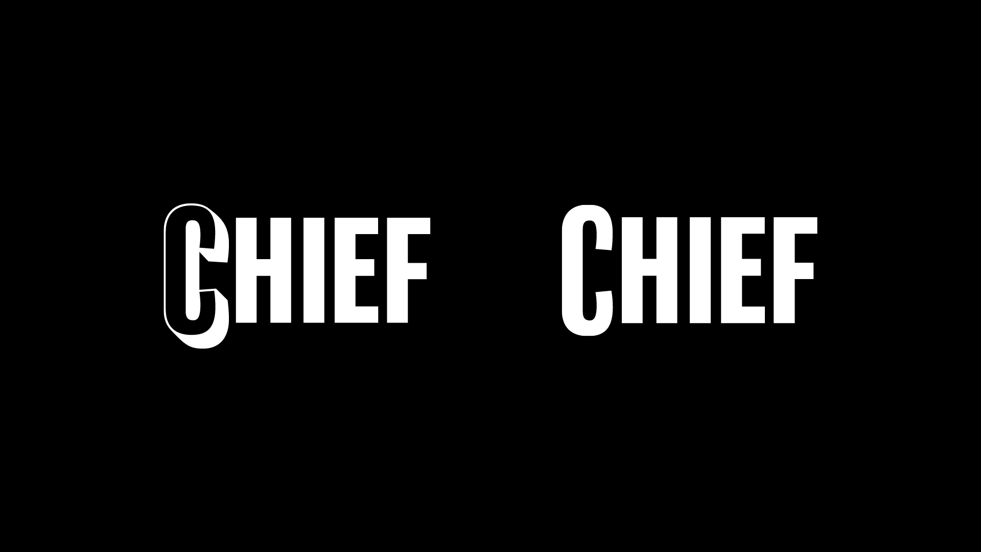
Chief
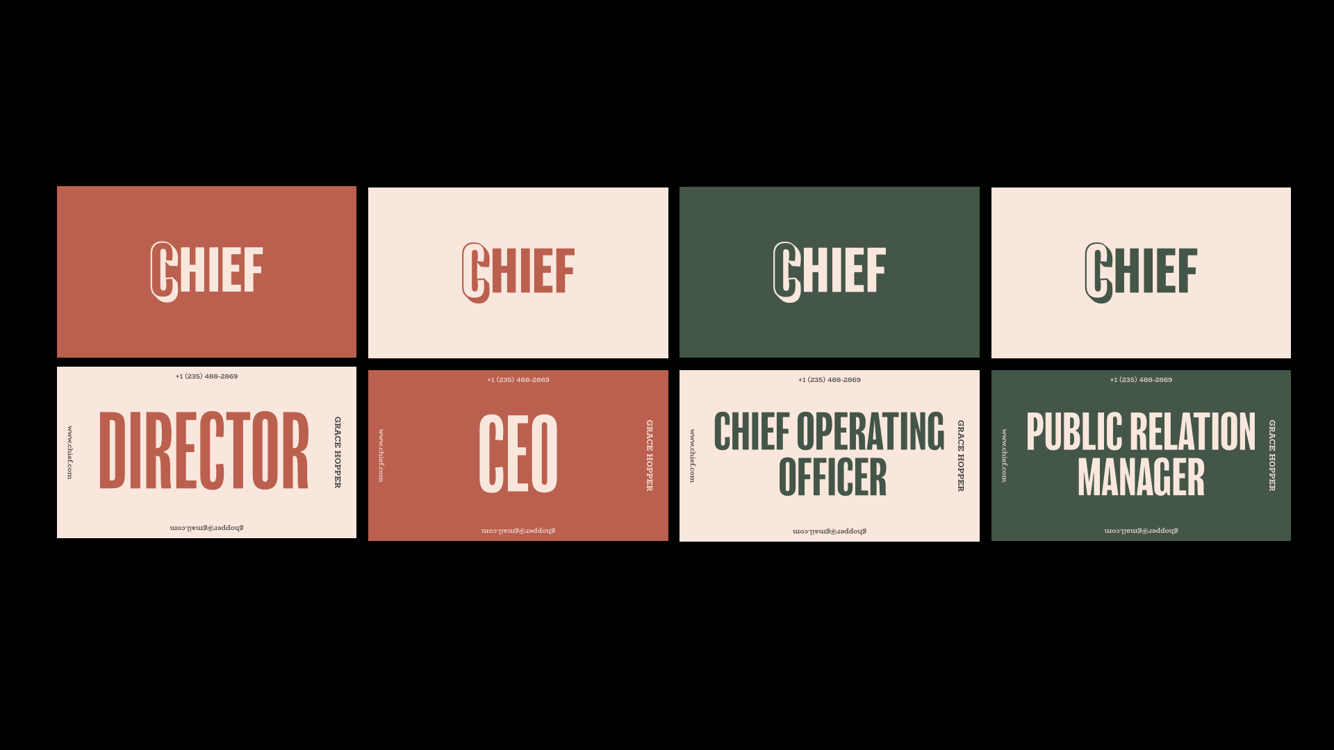
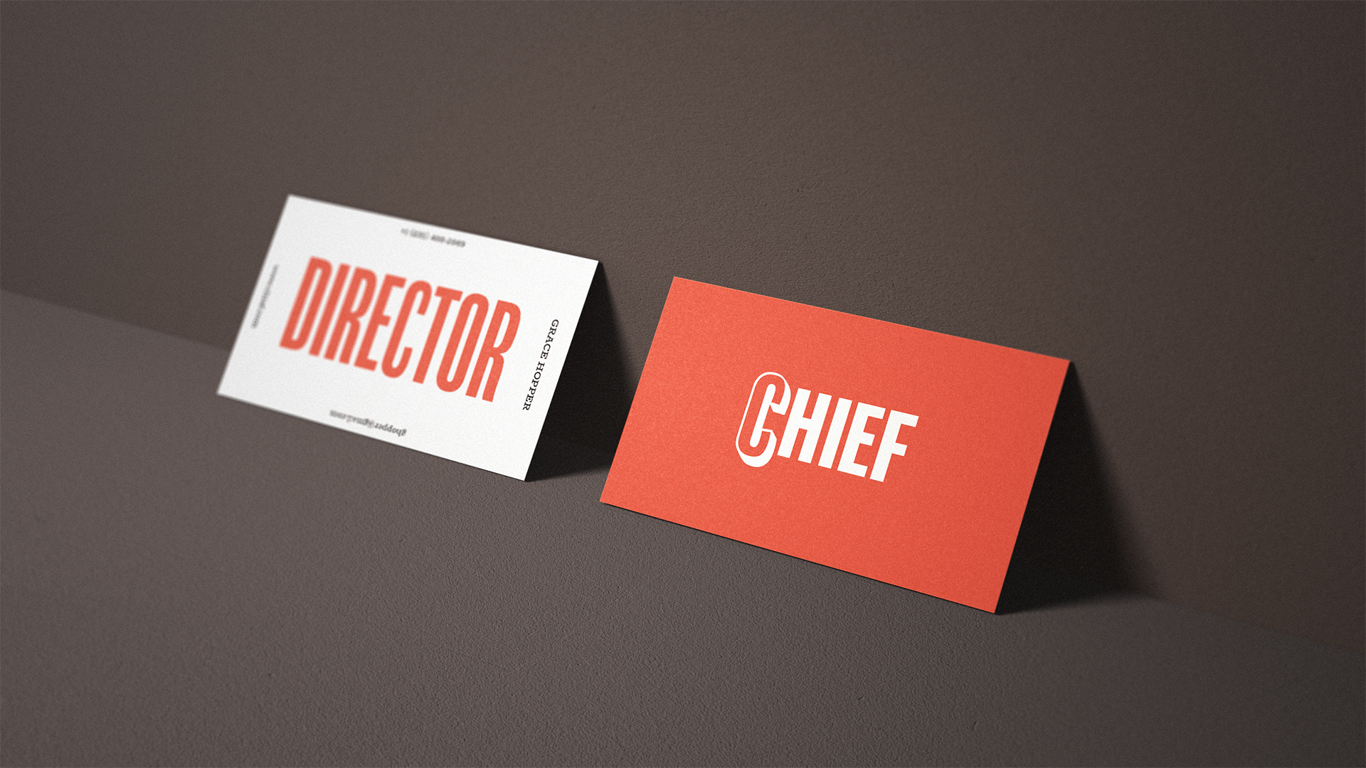
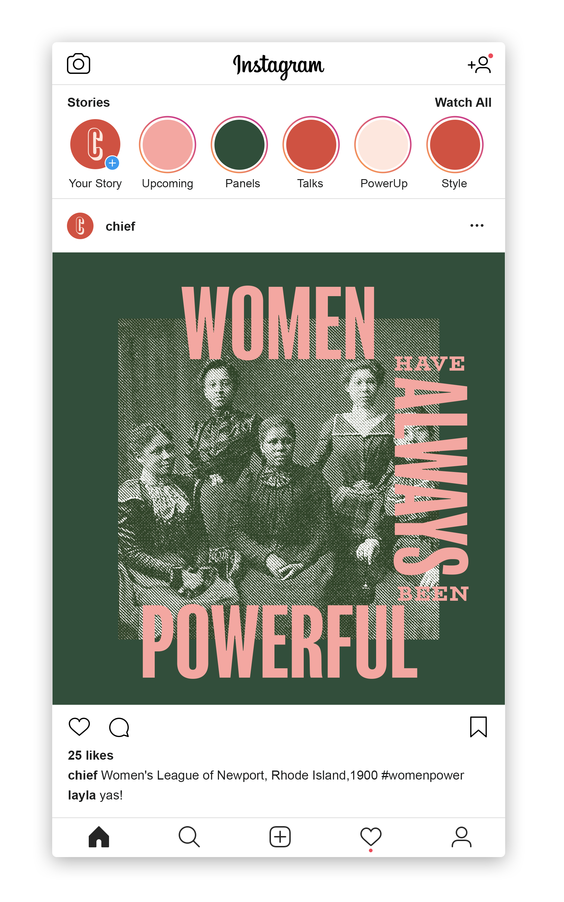
A brand identity design for CHIEF, a private network for connecting and supporting women leaders. With this identity system, I wanted to emphasize this group of strong female leaders by elevating their C-suite positions. An exclusive community of powerful women required a warm yet purposeful visual language.
This was a classroom project that aimed at rebranding an existing entity.
PROJECT MENTORS
Abbott Miller, Andrew Walters
MARYLAND INSTITUTE COLLEGE OF ART
2019
PROJECT MENTORS
Abbott Miller, Andrew Walters
MARYLAND INSTITUTE COLLEGE OF ART
2019
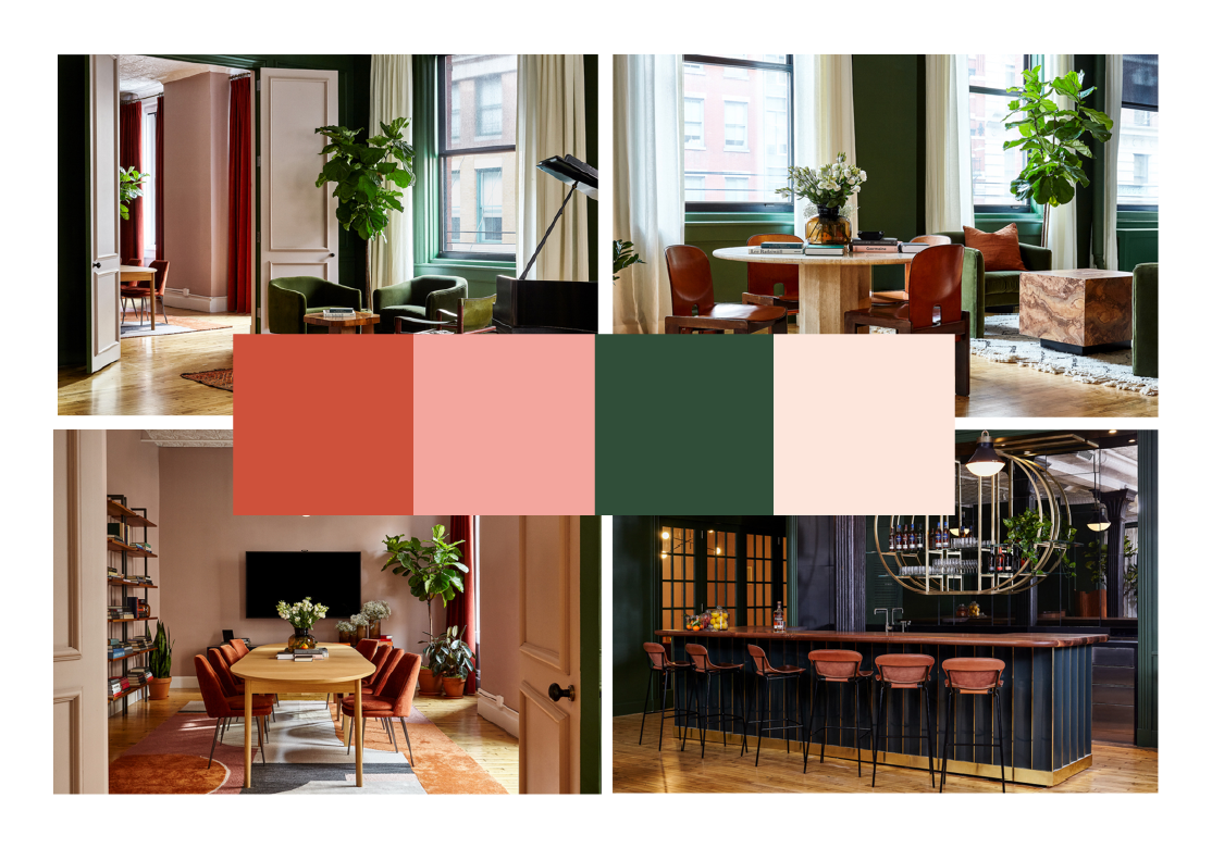
Colours inspired from the interiors of the space.

VISUAL LANGUAGE
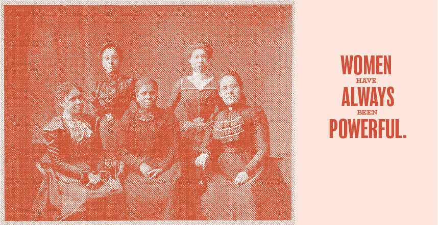
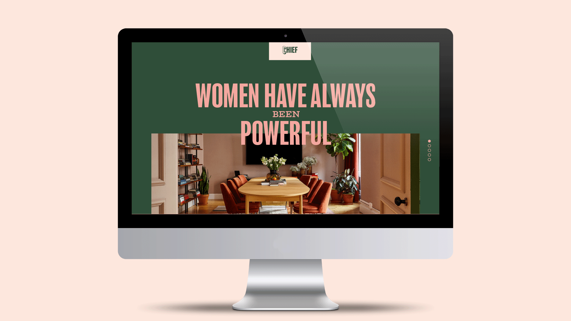
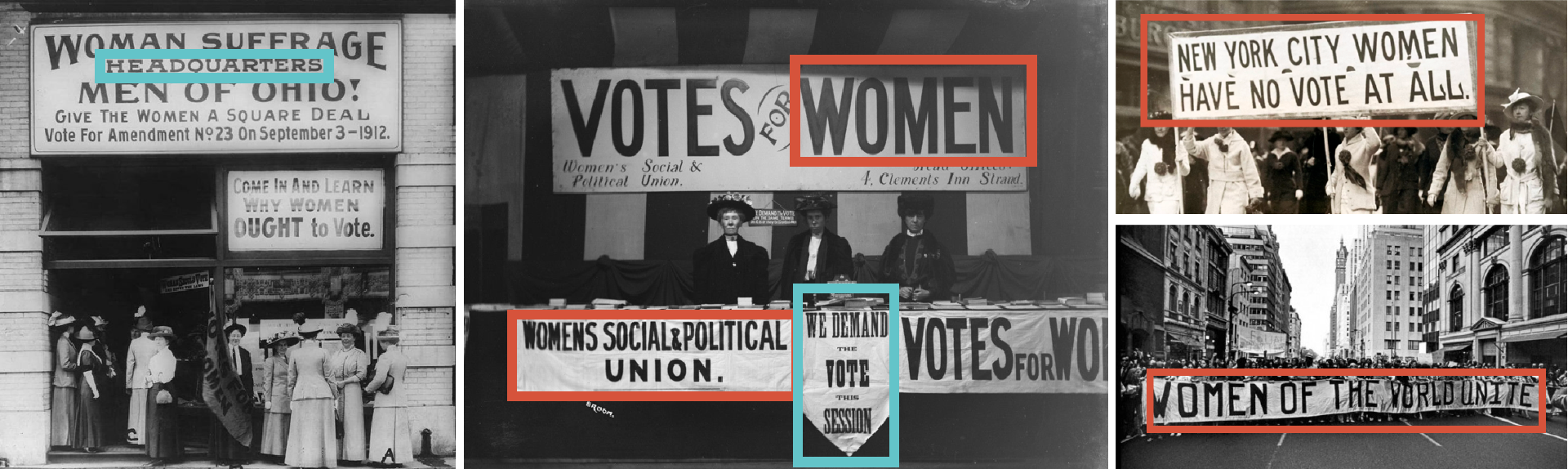
Inspiration for the typography was derived from signs and posters from Women’s Suffrage Movement. Taking instances in history when women have come together for a greater purpose, reinforcing the idea behind their tagline: Women have always been powerful.
Typography
Inspiration for the typography was derived from signs and posters from Women’s Suffrage Movement. Taking instances in history when women have come together for a greater purpose, reinforcing the idea behind their tagline: Women have always been powerful.


VISUAL LANGUAGE
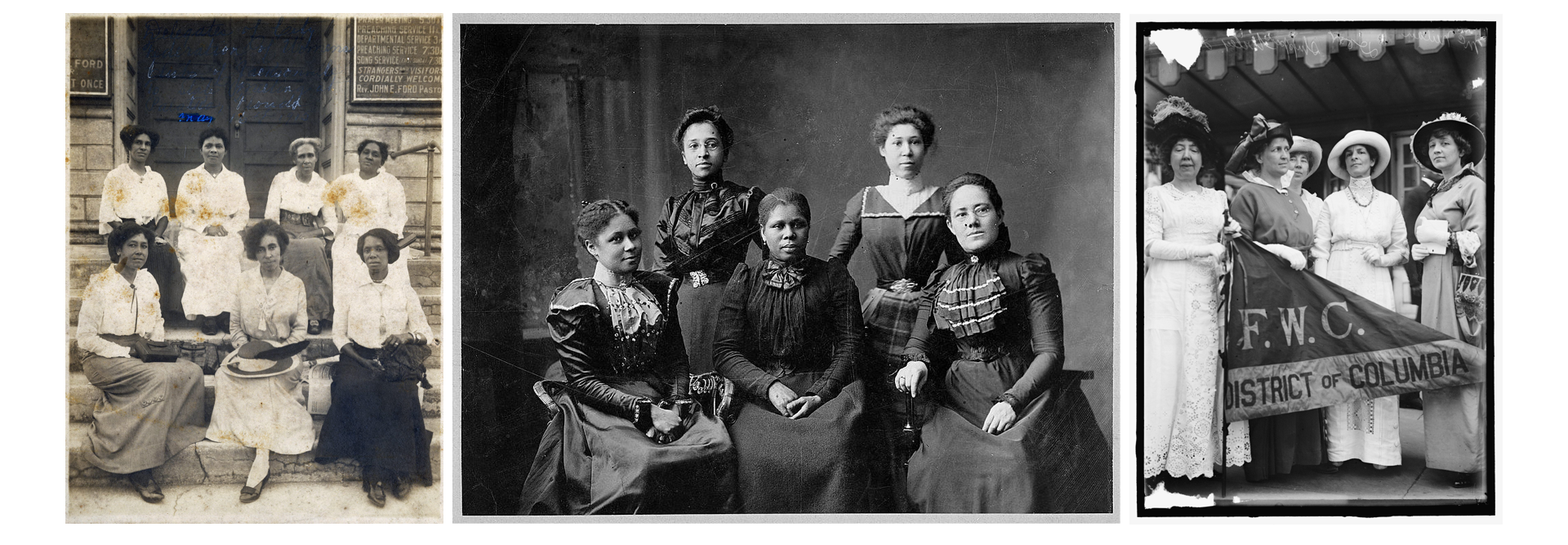
I looked into historical women clubs and federations and their portraiture style. The photography has a warm yet purposeful quality to it which resonates with Chief.
Imagery
I looked into historical women clubs and federations and their portraiture style. The photography has a warm yet purposeful quality to it which resonates with Chief.
IMAGES FROM THE LEFT:
1. City Federation of Colored Women’s Clubs of Jacksonville, State Meeting,Florida,19152. Women's League of Newport, Rhode Island,19003. Federation Of Women's Clubs, D.C. Leaders of Delegation to White House,1914